Types of Services
-

Logo Design
A logo is the very first step in establishing a brand identity. It can make your brand instantly recognisable and memorable to your audience.
-

Identity design
The logo, colors, type, and visual system that makes your value instantly recognizable and impossible to ignore.
-

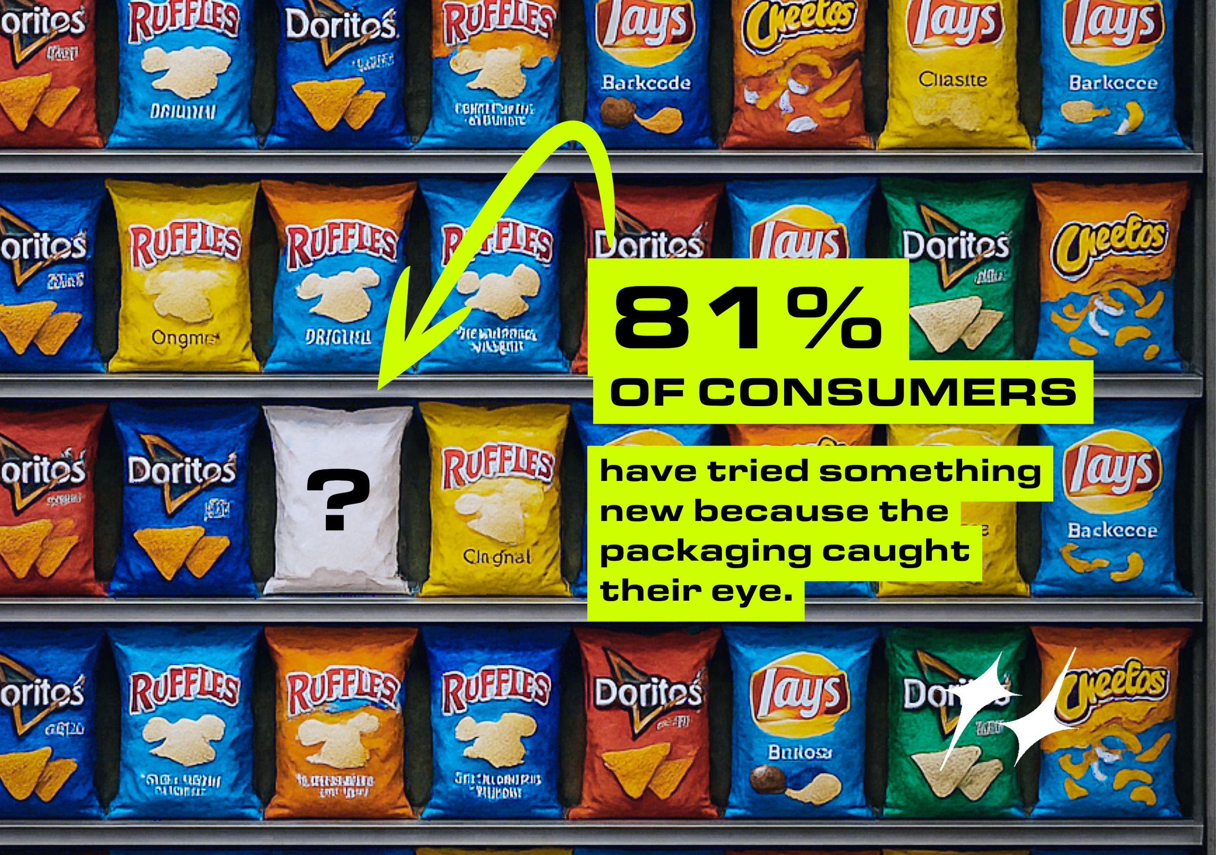
Packaging
Packaging services aren’t just about making things look good. It’s about understanding your audience and designing solutions around their needs.
-

Graphic Design
Graphic design that’s built, not borrowed. Each piece is custom-crafted to reflect a brand’s personality. No templates, no trends, no shortcuts in this design.
Why It Works

Standing out beats fitting in every time.
In a world full of copycats and Canva templates, blending in is a death sentence. Design that actually gets attention starts with one thing: being different on purpose.
Every brand I create starts with clarity:
What do you do? Who is it for? Why should they care? Only then do we build the identity! That way, your visuals mean something, not just look good.
Brands I’ve Helped Stand Out

We rebuilt everything from the ground up! Starting with strategy, then designing a bold new logo and packaging that actually spoke to their ideal customer. The result? A brand that finally looked the part.
Once it launched, engagement shot up 200%. Not because the product changed, but because now, people noticed.
KMF SAW 200% Engagement INCREASE after their new logo

We created a branded web page that clearly communicated their value, elevated their credibility, and guided customers straight to the sale. No fluff. Just focused messaging and intentional design.
The result? A 30% increase in monthly sales, just by making the brand work as hard as the business.
REEKON INCREASED MONTHLY SALES BY 30% WITH A BRANDED WEBSITE PAGE
*IMPOSIBLE TO IGNORE*
*IMPOSIBLE TO IGNORE*
Good branding doesn’t whisper. It grabs attention.
Let’s make yours impossible to ignore.
